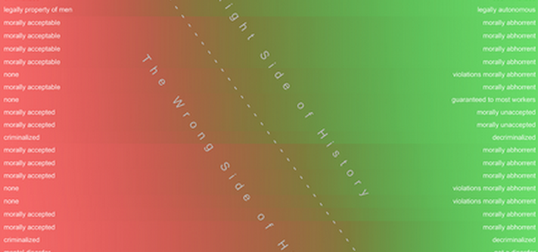
The following chart was created to provide a bird’s-eye view of the trend of human moral progress over the course of the past 4,000 years, and to visually represent what it means to be on the right and wrong sides of history:

Keep in mind the chart is not intended to suggest that every instance of change in every society’s morality is for the better. What it does indicate, however, is that instances of moral regression are by no means the overall norm, and each one swims against the current of overall human moral progress.
With its sea of red clouding the present and future, the chart also acts as an important reminder that The Old Morality remains organized and strong, ready to wage culture war against each newly proposed change for the better in the way we behave toward one another.

Facebook Comments